POSTERMYWALL · EMAIL MARKETING · 2026
Helping Small businesses publish email campaigns with confidence
MY ROLE
Owned the end-to-end design
UX flows & interaction design
Dev Handoff
Team
Maida Tahir · Product Manager
Shuja Hussain · Engineering
Me · Design
Timeline
December 2025 - March 2026
THE CONTEXT
25 million emails had already been sent. But publishing them still wasn't easy.
When I joined this project, PosterMyWall's email product was already mature.
It had been around for more than 6 years, more than 25 million emails had been sent through it, and thousands of users were actively using it.
This wasn't a new product looking for its first workflow.
But the data was telling us something wasn't quite right: we were seeing a 34% drop-off during the publishing journey.
That became our starting point.
34%
Drop off during the publishing journey
25.5M+
Email Sent
2,091
Active Email users
Email campaign usage over the last year Shuja helped me pull this off
THE CONTEXT
The problem wasn't creating an email. It was everything that came after.
PosterMyWall already made creating an email relatively straightforward.
Publishing one was different.
Before an email could go out, users had to make several decisions: who should receive it, what is send at best time, when it should be delivered, and whether everything was configured correctly.
Individually, none of these decisions was particularly difficult.
Together, they created a lot to think about at the exact moment users were about to do something they couldn't easily undo.
So I framed the challenge around a simple question:
How might we make publishing feel simpler and more confident without taking control away from experienced users?
THE CONTEXT
One workflow. Thousands of campaigns.
Every email created on PosterMyWall eventually passes through the publishing flow before reaching customers.
That made this one of the product's most important experiences and one where even small improvements could have a meaningful impact.
THE CONTEXT
One workflow. Thousands of campaigns.
Every email created on PosterMyWall eventually passes through the publishing flow before reaching customers.
That made this one of the product's most important experiences and one where even small improvements could have a meaningful impact.
88,000
Emails sent annually
24
Active businesses
4
Years of product maturity
Email campaign usage over the last year Shuja helped me pull this off
THE CHALLENGE
I thought I was redesigning a few screens.
I wasn't.
The more I explored the workflow, the more I realized the interface wasn't the real problem.
The workflow was.
Every feature had been added to solve a real need, but together they created an experience that constantly interrupted momentum.
Instead of helping users publish an email, the product repeatedly asked them to stop, think, and make decisions.
That became the real design challenge.
First step · Add details

Second step · Select mailing lists

Third step · Review & Send

THE INSIGHT
One thing I couldn't ignore.
The experience wasn't asking users to do difficult things. It was asking them to make too many decisions. That simple observation became the foundation for everything that followed.
Mind icon here
Think Less
Mind icon here
Feel Confident
Mind icon here
Move Faster
Research summary
Listening before designing
Before opening Figma, I went looking for evidence. Support tickets, session recordings, user conversations, competitor flows — I wanted to understand where the existing experience was failing before deciding how to fix it.

Found 3 key players in the space
All competing for the same audience, with different tradeoffs.

Mailchimp

Outseta

Brevo
Powerful, but built for marketers. The depth that makes it great for large teams makes it overwhelming for creators.
Built for SaaS businesses, not content creators. The technical setup required puts it out of reach for most PosterMyWall users.
Functional and affordable, but transactional by design. No creative flow, no visual identity just forms and buttons.
PosterMyWall sits in a gap none of these tools fill — simple enough for creators, capable enough for campaigns. The opportunity was to lean into that: a wizard that feels guided, not technical.
Understanding the space
Before looking outward, I looked inward
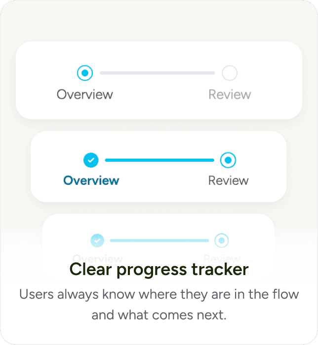
PosterMyWall had recently shipped Events — a different feature but the same core challenge: guide a non-technical user through a multi-step flow without losing them. Completion rates were strong. Hesitation was low. That felt worth studying.
So instead of starting from scratch, I put both flows side by side. Three things stood out immediately — things the Email wizard was missing that Events got right.


DESIGN DECISION #1
Finding the right audience shouldn't feel like searching.
As mailing lists grew, simply finding the right audience became harder than it should have been.
Instead of redesigning mailing lists, I focused on making them easier to discover.
DESIGN DECISION #2
Scheduling should adapt to people, not the other way around.
Not every campaign needs advanced scheduling.
By progressively revealing additional options only when users needed them, the experience became simpler without becoming less powerful.
DESIGN DECISION #3
One place to review everything.
One thing I kept noticing was how often users jumped backwards just to double-check information.
Bringing everything together into one review experience turned publishing into confirmation instead of recollection.
DESIGN DECISION #4
End the journey with confidence.
Publishing doesn't end when someone clicks Publish.
It ends when they're confident their campaign is on its way.
The confirmation experience now explains what happens next instead of simply saying Success.
THE DETAILS
The smallest decisions often matter the most.
Not every improvement deserves a full section.
Some of the biggest wins came from tiny decisions that quietly reduced friction throughout the experience.


THE OUTCOME
Simplicity that scales.
The redesign created a publishing experience that feels calmer, faster, and more predictable, while providing a stronger foundation for future improvements.
Although the interface became simpler, the flexibility users relied on remained intact.
62%
Improvement in task completion rate
20%
Increase in feature adoption
46%
Drop in support queries about send time
Outcome metrics are post-launch, measured over 7 weeks after release
Reflection
If I learned one thing...
The simplest designs hold a lot of complexity.
My job isn't to remove complexity — it's to absorb it so users don't have to. Every interaction that feels simple has a hundred decisions behind it that never make it to the screen.
In design, details matter & assumption kills.
The best decisions I made on this project came from conversations, not Figma. Bringing Shuja in early meant catching blind spots before they became design debt — not after.
Still things I'd do differently. But the numbers say we got the important stuff right.


PosterMyWall · 2025
Helping users find the right designs faster
VentureDive · 2023